Memphis Retooled
I've been watching the Machine Shop re/development for the past year and a half.
They took a simple commercial facade, located in a crook of South Main, as a frontend
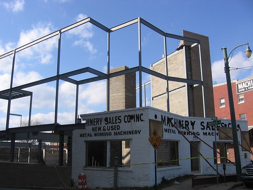
and built a new development into the backend.
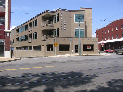
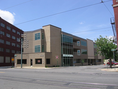
A nice combo by John Pruett Architects of traditional and modern, each giving value and texture to the other. My only complaint: I wish they had kept the previous paint job, including the commercial painted sign, to help the original facade pop out more.
Here's another facade, of much greater value, hopefully awaiting its own retooling.

This shouldn't be a South Main thing. The benefits of reuse, reimagination, remix are tangible, visual.
They took a simple commercial facade, located in a crook of South Main, as a frontend

and built a new development into the backend.


A nice combo by John Pruett Architects of traditional and modern, each giving value and texture to the other. My only complaint: I wish they had kept the previous paint job, including the commercial painted sign, to help the original facade pop out more.
Here's another facade, of much greater value, hopefully awaiting its own retooling.

This shouldn't be a South Main thing. The benefits of reuse, reimagination, remix are tangible, visual.
Labels: architecture, Memphis, redevelopment, South Main Arts District


8 Comments:
There is work being done to the Andertons restaurant. The entire building has been torn down with the exception of the facade. I don't remember who's moving in exactly, but at least they're keeping the facade.
i really thought they were going to keep the old signage on the machine shop. they left it there during so much of the construction...
apparently the anderton's project is turning out to be even more extensive than crye-leike was planning...i hope that they don't give up.
I thought that they were leaving the original facade paint also -- kudos to them for the adaptive reuse, but I think it would have been more faithful and much more interesting to retain the original facade paint.
They've already done a lot of work to save the facade of Anderton's. Seems you could put in a pretty simple and inexpensive backend and still have a wonderful building. Tearing down and rebuilding would be _more_ work it seems.
The problem with the paint job of Machine Shop is the original facade is kinda lost.
it gets worse. look what they've done now.
Sherman, I haven't driven down Madison in a few days. What have they done?
Or are you talking about the Machine Shop?
Machine shop replicated the painted-over name on a banner with crye-leike logo and hoisted it where the original painting was. So, it was not a mistake of ignorance painting over it; they chose to do so and then compounded their mistake by emphasizing it with a chee-z banner. Yuck.
[url=http://vonmertoes.net/][img]http://vonmertoes.net/img-add/euro2.jpg[/img][/url]
[b]live stock price software, [url=http://hopresovees.net/]english educational software[/url]
[url=http://hopresovees.net/][/url] academic software online software discount software
software used in canada [url=http://vonmertoes.net/]microsoft office 2003 software[/url] software to buy in
[url=http://bariossetos.net/]buy dreamweaver online[/url] adobe software student discounts
[url=http://vonmertoes.net/]guru academic edition software[/url] windows xp pro activation crack
oem software version [url=http://bariossetos.net/]second hand adobe software[/b]
Post a Comment
<< Home