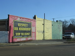
With
John Weeden of the Urban Art Commission has a great post, Without, on his personal blog. It's a visual statement of the art and design challenges facing Memphis' public realm, a prelude to the "With or Without" campaign that UAC will be re-launching soon.
I wanted to add these 2 thoughts.
I wanted to add these 2 thoughts.
- I hope the WorWO campaign is place-based. The public's visualizing With will be much easier in the actual public spaces. Pay for artists to transform, if just temporarily, those spaces. Advertise With art and architecture, in place.
- The ugliness of Memphis owes so much more to the dystopic land use and anti-design of politicians and developers than to graffiti taggers. So even if we could convince taggers to put down their cans, or pick up their skills, Memphis' blight of ugly would continue. The UAC, rather than just a arts sub-contractor for buildings pre-designed, could/should start influencing this world.
Take a look at this UAC piece by Mark Nowell at A.B. Brewster Elementary School, a block from the UAC's headquarters.
It's really cool, but as you might be able to tell, it's in the middle of a street-fronting parking lot, where it competes with the clutter of street lights for attention. So in addition to destroying the school's visual and urban presence, the street-fronting lot hides the power of the art piece.
In this case, the UAC could have been, perhaps, a public advocate for moving the parking lot to the back of the building and creating a space near the front of Sam Cooper which would include Nowell's piece integrated into a grand, inviting entrance for the backpacked kids walking down Sam Cooper towards their school.
As dystopia goes, A.B. Brewster is fairly mild. But it shows the visual and built oblivity of Memphis power elites that pushes much of the city and region to ugly. Other examples are speculative demolition and neglect, white flight abandonment and environmentally nasty clear-cutting.
The Powerless With Spraycans is not the real Without.
The Powerful With Vision is the real With.
Labels: architecture, art, placemaking, urban planning, UrbanArt Commission


1 Comments:
Another problem with this sculpture is that from the street, perspective wise, it is taller than the American & State flags. What happened to those civis classes we had years ago ? I think the siting of the sculpture was a real afterthought, or, if the artist was involved they may have said "...hell yeah, let's put it right out front!" OK, that last part was a cheap shot, but anytime you put something on axis with a public building it's a BFD and is usually reserved for, well - American flags. I like the sculpture, but the location is really bad, competing with & jumbling the facade of the school and it's relation to the street. The location was an afterthought and it really detracts from the sculpture itself.
Post a Comment
<< Home