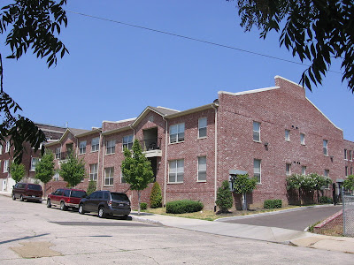
What's wrong with this picture?
 I had originally called it suburban, but I didn't like my dismissing a place (see Mary Cashiola's Flyer article for my misgivings). I could also call it cheap, but, at this point, given the technologies available to us, good design shouldn't cost us more than bad design, although in this case it may have. So I'll just call it wrong.
I think it's either the windows (particularly the double windows), the landscaping or a combination of both.
Bad windows really hurt a lot of otherwise good buildings.
Also, if you're going to landscape it like that, why have an offset from the sidewalk at all? It's dead space -- neither interesting nor useful.
Labels: architecture, Memphis


3 Comments:
Awful. And the brick color adds an air of "cheapness" IMHO...should not be allowed to build such an ugly building in that area of town...looks more like Raleigh than South Main. Yuck.
@Anon:
As a resident of Raleigh, I resent that. There's nothing even remotely that new out here. ;)
@Gates:
I get what you're saying about the windows. I think it's the same mindset that leads to endless rows of Bradford Pears, lone crepe myrtle islands in acres of parking lot, and those god-awful-ugly bridge railings around town. The words "contractor grade" really should be struck from the English language.
I think Bradford Pears should be banned from Memphis. What a worthless tree. Sure , they're cheap, but they have to be replaced every time a strong wind comes through.
Post a Comment
<< Home